
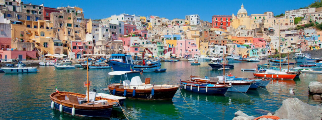
dirganews.com – Procida, a small yet captivating island in the Bay of Naples, Italy, is famous for its colorful seaside homes. From sunlit yellows and soft corals to ocean blues and gentle pastel greens, the island’s architecture creates a visual harmony that feels both joyful and timeless. While Procida attracts travelers and photographers from around the world, its influence has also reached the field of interior design.
What is often referred to as “Procida’s Color Palette” is more than a collection of paint shades. It represents a design philosophy rooted in Mediterranean culture, natural light, and emotional warmth. This palette has inspired designers, homeowners, and architects to bring the spirit of coastal Italy into contemporary living spaces.
In this article, we will explore the origins of Procida’s color palette, understand its defining tones, examine its benefits for interior design, review real-world product inspirations, and learn how to apply this aesthetic practically and sustainably.
Understanding Procida’s Color Palette
www.touringnaples.com
The Origins of Procida’s Colors
The vibrant colors of Procida did not begin as an artistic trend. Historically, local fishermen painted their homes in bold, contrasting colors so they could easily recognize them from the sea. Each family chose distinct shades, creating a patchwork of colors that gradually became part of the island’s identity.
Over generations, this practical tradition evolved into a cultural legacy. The island’s buildings now stand as symbols of warmth, resilience, and community. When translated into interior design, Procida’s palette captures the same spirit—welcoming, lively, and deeply connected to nature.
Designers around the world have embraced this aesthetic, adapting it into modern homes through wall paints, furnishings, textiles, and decorative accents.
Key Colors That Define Procida’s Palette
A harmonious mix of warm and cool tones defines Procida’s palette. Each color carries both visual and emotional significance.
- Warm yellows and ochres reflect sunlight and optimism, creating bright and cheerful interiors.
- Coral reds and soft pinks symbolize heritage, passion, and Mediterranean vitality.
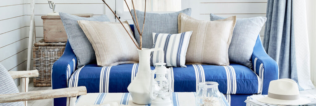
- Sea-inspired blues, from turquoise to deep navy, evoke calmness and connection to the ocean.
- Pastel greens bring a sense of freshness and natural balance.
- Whitewashed neutrals soften the palette and provide visual breathing space.
These colors can be used individually or layered together to create interiors that feel dynamic yet balanced.
Benefits of Using Procida’s Color Palette in Interior Design
Emotional and Psychological Impact
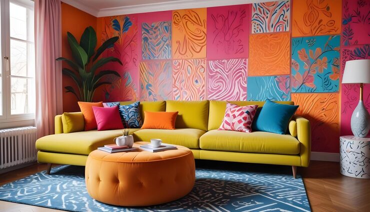
Color plays a powerful role in shaping emotions and behavior. Procida’s palette creates an environment that feels uplifting without being overwhelming. Warm hues such as yellow and coral bring energy and friendliness, making them ideal for social spaces like living rooms and kitchens.
Cooler tones like turquoise and pastel green introduce calmness and relaxation, making them perfect for bedrooms, bathrooms, or reading areas. When combined thoughtfully, these colors promote emotional balance, reduce stress, and enhance overall well-being.
Homes designed with this palette often feel more alive and welcoming, supporting both mental comfort and creativity.
Enhancing Natural Light
One of the strongest advantages of Procida’s palette is its interaction with light. Inspired by Mediterranean architecture, these colors are designed to reflect and amplify natural daylight.
Pastel tones and light neutrals help brighten interiors, making smaller or darker rooms appear more spacious. Even in urban apartments with limited sunlight, Procida-inspired colors prevent spaces from feeling flat or gloomy.
Strategic use of color—such as accent walls or reflective tiles—can significantly enhance brightness without relying heavily on artificial lighting.
Versatility Across Design Styles
Although rooted in Mediterranean tradition, Procida’s palette adapts surprisingly well to modern interiors. In minimalist homes, a single pop of turquoise or coral can serve as a focal point against neutral backgrounds.
In bohemian or eclectic spaces, multiple colors can be layered for a rich and expressive atmosphere. Even industrial interiors benefit from the palette, as soft blues and warm yellows balance raw materials like concrete and metal.
This versatility makes Procida’s palette suitable for long-term use, unlike short-lived design trends.
Cost-Effective Interior Transformation
Redesigning an interior does not always require major renovations. Procida’s palette allows homeowners to achieve noticeable transformations through small, affordable changes.
Simple updates such as painting one accent wall, adding colorful cushions, or installing patterned tiles can dramatically alter a room’s mood. Because the colors work well with wood, stone, and neutral furniture, existing decor can often be retained.
This makes the palette accessible to a wide range of budgets while still delivering a strong visual impact.
Sustainability and Longevity
Many modern products inspired by Procida’s palette are designed with sustainability in mind. Eco-friendly paints, low-VOC finishes, organic textiles, and recycled ceramics allow homeowners to adopt this aesthetic responsibly.
The timeless nature of these colors also supports long-term use, reducing the need for frequent redecorating and minimizing waste.
Real-World Products Inspired by Procida’s Color Palette
Mediterranean-Inspired Wall Paint Collections
img.freepik.com
Several paint manufacturers offer Mediterranean-themed collections inspired by coastal Italy. These collections typically include curated shades of yellow, coral, turquoise, and pastel green.
Formulated with modern low-VOC technology, these paints provide long-lasting vibrancy while maintaining indoor air quality. Using these collections allows homeowners to recreate the warmth and brightness of Procida’s architecture indoors.
Coastal Textiles and Upholstery
www.justfabrics.co.uk
Textile brands have embraced Procida’s palette through cushions, curtains, rugs, and upholstery. Coral-patterned cushions or turquoise drapes instantly bring character to neutral interiors.
Textiles are especially effective because they offer flexibility. Seasonal updates are easy, allowing homeowners to refresh their interiors without permanent changes.
Procida-Inspired Ceramic Tiles
Ceramic tiles inspired by Procida often feature geometric or floral patterns combining blues, greens, and yellows. These tiles work beautifully in kitchens, bathrooms, and outdoor spaces.
Their durability and artistic appeal make them practical and decorative at the same time, turning functional surfaces into visual highlights.
Decorative Lighting with Color Accents
Lighting fixtures inspired by Procida’s palette combine function with artistry. Colored glass pendants or painted metal sconces add warmth and visual interest to interiors.
A single turquoise or coral lighting fixture can become a focal point, enhancing ambiance without overwhelming the space.
Benefits of Procida-Inspired Products
- Design versatility: These products adapt to various interior styles, from modern to rustic.
- Long-term value: High-quality materials ensure durability and color retention.
- Sustainability: Many brands prioritize eco-friendly production methods.
Together, these benefits make Procida-inspired products practical and stylish choices for contemporary homes.
How Procida’s Palette Solves Common Design Problems

img.goodfon.com
Reviving Neutral Interiors
Modern interiors often rely heavily on whites and grays. Procida’s colors introduce warmth and personality, preventing spaces from feeling sterile.
Improving Small Spaces
Light pastels and reflective finishes create the illusion of space, making compact rooms feel more open and airy.
Creating Clear Focal Points
Bold colors can act as focal elements, reducing the need for excessive decor and simplifying design decisions.
Connecting Indoor and Outdoor Spaces
The palette naturally complements balconies, terraces, and gardens, creating a smooth transition between interior and exterior environments.
How to Integrate Procida’s Palette into Your Home
Start small by choosing one or two colors that resonate with your space. Use them as accents through paint, textiles, or decor. Gradually layer additional tones as confidence grows.
Balance is key. Allow neutral elements to support the brighter shades, ensuring the space feels harmonious rather than overwhelming.
Frequently Asked Questions
What makes Procida’s color palette unique?
Its distinctive mix of vibrant and pastel tones creates a lively yet balanced aesthetic rooted in cultural history.
Can this palette work in modern homes?
Yes. Selective use of color enhances modern interiors without compromising simplicity.
Is it expensive to apply this palette?
No. Affordable options like paint and textiles make it accessible to most budgets.
Conclusion
Procida’s color palette offers more than visual beauty—it brings emotion, culture, and warmth into modern interiors. Inspired by centuries-old traditions, these colors remain relevant and adaptable today.
By integrating Procida-inspired tones into interior design, homeowners can create spaces that feel bright, welcoming, and deeply connected to Mediterranean heritage. Whether through subtle accents or bold transformations, this palette provides a timeless approach to designing meaningful living environments.